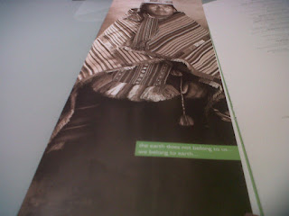
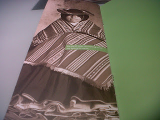
You might think this is some sort of catalog for United Colors of Benetton when you see these images, well, at least I would.
Those pictures are actually found within the menu of none other than Waterlemon.
Strangely enough, they have adopted these Indian pictures in a United
Colors of Benetton - like design, which does not particularly match the
rest of their brand's image, their restaurant's interior design... nor
their food; or so I think.
The restaurant is described on their own website as "sleek and modern" and with adjectives like "fresh" and "aqueous".
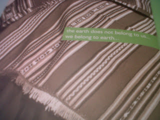
Moreover, regarding the writing "The earth does not belong to us... we belong to earth..."
I'm not exactly keen on this sentence's punctuation, let alone its relation with the restaurant; but that's just me.
Ok, so United Colors of Benetton are actually known for campaigns filled with controversy. They have showcased black and white people (more than) mingling and homosexuality when it was a huge taboo, and lately their viral 'unhate' campaign displays a complete disrespect for all forms of authority. Yes, shock advertising has always been their forte.
Nonetheless, displaying models of different racial backgrounds is also one of their main advertising characteristics.
What do YOU think?


